

<!DOCTYPE html>
<html lang="zh-CN">
<head>
    <meta charset="UTF-8" />
    <meta name="viewport" content="width=device-width, initial-scale=1.0" />
    <title>创客贴风格 - 彩色转动背景</title>
    <style>
        /* ===== 你提供的样式 ===== */
        .password-tip[data-v-12feadaf]:last-of-type(.password-tip-cell) {
            margin-bottom: 0;
        }

        html {
            font-size: 100px;
            -webkit-user-select: none;
            user-select: none;
        }

        body {
            font: 14px/1.2 -apple-system, PingFang SC, Hiragino Sans GB, Arial, Microsoft YaHei, Helvetica Neue, sans-serif;
            text-rendering: optimizeLegibility;
            display: flex;
            justify-content: center;
            align-items: center;
            min-height: 100vh;
            background: #f0f2f5;
            padding: 20px;
        }

        body,
        div {
            padding: 0;
            margin: 0;
            font-size: 14px;
        }

        * {
            box-sizing: border-box;
            -moz-box-sizing: border-box;
            -webkit-box-sizing: border-box;
            -webkit-font-smoothing: antialiased;
        }

        ckt-cop-new-header::part(headWrap) {
            position: static;
        }

        /* ===== 新增:彩色转动背景核心样式 ===== */

        /* 外层容器 - 负责裁切旋转内容 */
        .rotate-container-res {
            position: relative;
            width: 100%;
            height: 100%;
            /* 裁切溢出的旋转块 */
            overflow: hidden;
            border-radius: 32px;
            /* 确保子元素 absolute 相对于此定位 */
        }

        /* 两个旋转的彩色块 - 共同实现彩色转动效果 */
        .block-1,
        .block-3 {
            position: absolute;
            border-radius: 50%;
            /* 关键:持续旋转 */
            animation: spin 8s linear infinite;
            /* 柔化边缘,让颜色融合更自然 */
            filter: blur(60px);
            opacity: 0.85;
        }

        /* 第一个彩色块 - 大尺寸,暖色系 */
        .block-1 {
            width: 80%;
            height: 80%;
            top: -20%;
            left: -20%;
            background: conic-gradient(
                from 0deg,
                #ff6b6b,
                #feca57,
                #ff9ff3,
                #ff6b6b
            );
            animation-duration: 10s;
            animation-direction: reverse;
        }

        /* 第二个彩色块 - 中等尺寸,冷色系,错开位置和速度 */
        .block-3 {
            width: 60%;
            height: 60%;
            bottom: -10%;
            right: -10%;
            background: conic-gradient(
                from 180deg,
                #54a0ff,
                #5f27cd,
                #1dd1a1,
                #54a0ff
            );
            animation-duration: 6s;
            animation-delay: -1s;
        }

        /* 旋转动画 */
        @keyframes spin {
            100% {
                transform: rotate(360deg);
            }
        }

        /* ===== 数据卡片容器 ===== */
        .data-box {
            width: 1200px;
            max-width: 100%;
            border-radius: 32px;
            overflow: hidden;
            box-shadow: 0 20px 60px rgba(0, 0, 0, 0.12);
            /* 让 .rotate-container-res 撑满 */
            position: relative;
        }

        /* 让旋转容器撑满 data-box */
        .rotate-container-res {
            position: absolute;
            top: 0;
            left: 0;
            width: 100%;
            height: 100%;
            z-index: 0;
        }

        /* ===== 内容层 ===== */
        .content-box {
            position: relative;
            z-index: 1;
            display: flex;
            flex-wrap: wrap;
            justify-content: space-between;
            align-items: center;
            padding: 56px 60px 48px 60px;
            /* 毛玻璃效果 */
            background: rgba(255, 255, 255, 0.78);
            backdrop-filter: blur(12px);
            -webkit-backdrop-filter: blur(12px);
            border-radius: 32px;
            min-height: 260px;
        }

        /* ===== 左侧文字 ===== */
        .left {
            flex: 0 0 auto;
            max-width: 420px;
        }

        .sub-title {
            font-size: 36px;
            font-weight: 700;
            color: #1a1a2e;
            line-height: 1.3;
            letter-spacing: 0.5px;
        }

        .small-des {
            margin-top: 12px;
            font-size: 16px;
            color: #4a4a5a;
            line-height: 1.6;
            opacity: 0.85;
        }

        /* ===== 按钮 ===== */
        .button {
            display: inline-flex;
            align-items: center;
            gap: 8px;
            margin-top: 24px;
            padding: 14px 40px;
            background: linear-gradient(135deg, #5f27cd, #341f97);
            color: #fff;
            font-weight: 600;
            font-size: 18px;
            border-radius: 60px;
            cursor: pointer;
            transition: all 0.3s ease;
            box-shadow: 0 8px 24px rgba(95, 39, 205, 0.35);
        }
        .button:hover {
            transform: translateY(-2px) scale(1.02);
            box-shadow: 0 12px 32px rgba(95, 39, 205, 0.45);
        }
        .button .buttom-name {
            letter-spacing: 1px;
        }
        .button .buttom-icon {
            display: inline-block;
            width: 20px;
            height: 20px;
            background: url("data:image/svg+xml,%3Csvg xmlns='http://www.w3.org/2000/svg' viewBox='0 0 24 24' fill='white'%3E%3Cpath d='M12 4l-1.41 1.41L16.17 11H4v2h12.17l-5.58 5.59L12 20l8-8z'/%3E%3C/svg%3E") no-repeat center;
            background-size: contain;
        }

        /* ===== 右侧数据 ===== */
        .right {
            display: flex;
            flex-wrap: wrap;
            justify-content: flex-end;
            gap: 20px 36px;
            flex: 1 1 auto;
            margin-left: 20px;
        }

        .num-container {
            text-align: center;
            min-width: 80px;
        }
        .num-container > div {
            display: flex;
            align-items: baseline;
            justify-content: center;
            gap: 2px;
        }
        .number {
            font-size: 32px;
            font-weight: 800;
            color: #1a1a2e;
            line-height: 1.2;
        }
        .unit {
            font-size: 18px;
            font-weight: 600;
            color: #1a1a2e;
            margin-left: 2px;
        }
        .number-title {
            margin-top: 6px;
            font-size: 14px;
            color: #5a5a6e;
            letter-spacing: 0.3px;
            white-space: nowrap;
        }

        /* ===== 响应式 ===== */
        @media (max-width: 900px) {
            .content-box {
                flex-direction: column;
                align-items: flex-start;
                padding: 36px 28px 28px;
            }
            .left {
                max-width: 100%;
                margin-bottom: 28px;
            }
            .right {
                justify-content: flex-start;
                margin-left: 0;
                gap: 16px 24px;
                width: 100%;
            }
            .num-container {
                min-width: 65px;
            }
            .number {
                font-size: 24px;
            }
            .unit {
                font-size: 14px;
            }
            .sub-title {
                font-size: 28px;
            }
            /* 调整旋转块大小,避免在小屏上过于拥挤 */
            .block-1 {
                width: 120%;
                height: 120%;
                top: -30%;
                left: -30%;
            }
            .block-3 {
                width: 100%;
                height: 100%;
                bottom: -20%;
                right: -20%;
            }
        }

        @media (max-width: 480px) {
            .content-box {
                padding: 24px 16px 20px;
            }
            .right {
                gap: 10px 12px;
            }
            .num-container {
                min-width: 50px;
            }
            .number {
                font-size: 18px;
            }
            .unit {
                font-size: 11px;
            }
            .number-title {
                font-size: 10px;
                white-space: normal;
            }
            .sub-title {
                font-size: 20px;
            }
            .small-des {
                font-size: 13px;
            }
            .button {
                padding: 10px 22px;
                font-size: 14px;
            }
            /* 小屏下 blur 值调低,避免性能问题且保持可见 */
            .block-1,
            .block-3 {
                filter: blur(40px);
            }
        }
    </style>
</head>
<body>

    <div class="data-box">
        <!-- 旋转背景容器 -->
        <div class="rotate-container-res">
            <div class="block-1"></div>
            <div class="block-3"></div>
        </div>

        <!-- 内容 -->
        <div class="content-box">
            <div class="left">
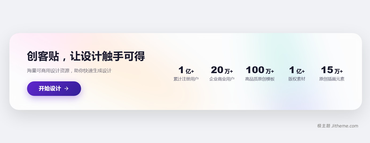
                <div class="sub-title">创客贴,让设计触手可得</div>
                <div class="small-des">海量可商用设计资源,助你快速生成设计</div>
                <div class="button">
                    <span class="buttom-name">开始设计</span>
                    <span class="buttom-icon"></span>
                </div>
            </div>
            <div class="right">
                <div class="num-container">
                    <div><span class="number">1</span><span class="unit">亿+</span></div>
                    <div class="number-title">累计注册用户</div>
                </div>
                <div class="num-container">
                    <div><span class="number">20</span><span class="unit">万+</span></div>
                    <div class="number-title">企业商业用户</div>
                </div>
                <div class="num-container">
                    <div><span class="number">100</span><span class="unit">万+</span></div>
                    <div class="number-title">高品质原创模板</div>
                </div>
                <div class="num-container">
                    <div><span class="number">1</span><span class="unit">亿+</span></div>
                    <div class="number-title">版权素材</div>
                </div>
                <div class="num-container">
                    <div><span class="number">15</span><span class="unit">万+</span></div>
                    <div class="number-title">原创插画元素</div>
                </div>
            </div>
        </div>
    </div>

</body>
</html>
温馨提示:
文章标题:AI帮写的仿创可贴统计模块样式
文章链接:https://www.jitheme.com/8015.html
更新时间:2026年07月09日
1.本站大部分内容均收集于网络!若内容若侵犯到您的权益,请发送邮件至:service@jitheme.com,我们将第一时间处理!
2.资源所需价格并非资源售卖价格,是收集、整理、编辑详情以及本站运营的适当补贴,并且本站不提供任何免费技术支持。
3.所有资源仅限于参考和学习,版权归原作者所有,更多请阅读极(子)主题网络服务协议。